
A control chart Excel process is a useful tool for studying how processes or other data changes over time. The chart consists of four lines -- the data, a straight line representing the average, as well as an upper control limit and a lower control limit (ucl and lcl in Excel).
UCL and LCL in Excel
Video of the Day
Step 1
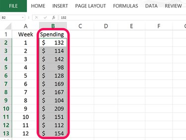
Open a blank Excel worksheet. Type the name you want to use for your data in cell B1 and then enter the data for your chart in that column. In our example, 12 numbers are entered in cells B2 through B13.
Video of the Day
Step 2
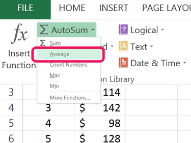
Select a blank cell below your data in column B. Click the Formula tab and then click the small Arrow beside the AutoSum button. Select Average from the drop-down menu. Highlight the cells containing the data and press Enter.
Step 3
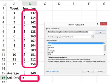
Select the blank cell beneath the cell used to calculate the data average. In our example, this is cell B16. Click the small Arrow beside the AutoSum button again. This time select More Functions. Click STDEV in the window that opens, highlight the cells containing the data and press Enter.
Step 4
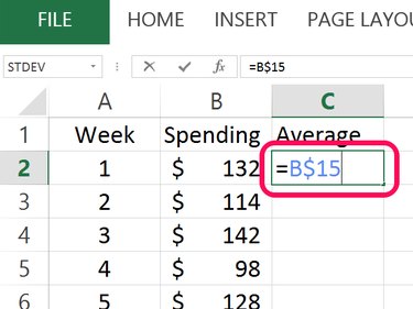
Type Average in cell C1 and then click cell C2. Type = and then click the cell containing the average. Insert a $ between the column letter and row number and then press Enter. In our example, the formula is =B$15.
Step 5
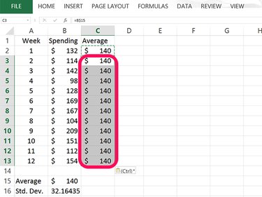
Select cell C2 and press Ctrl-C to copy it. Drag the cursor over the blank cells in column C that have a value beside them and then press Ctrl-V to fils each cell with the average. When you plot the control chart, having these cells filled with the same number gives you a straight average line.
Step 6
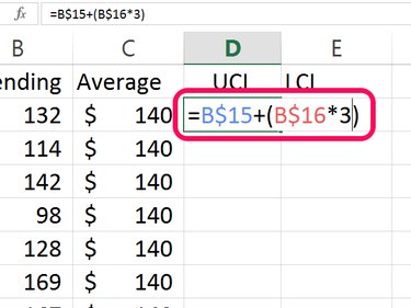
Type UCL in cell D1 to specify the Upper Control Limit. The UCL is calculated by adding the average to 3 times the standard deviation. Type the following formula into this cell, replacing "B15" and "B16" with cells containing your average and your standard deviation: =B15 + (B16*3)
Insert a $ between the cell and row for each cell and then press Enter. Your final formula in this cell should look like this: =B$15 + (B$16*3)
Step 7
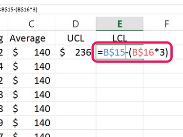
Type LCL in cell E1 for the Lower Control Limit. The LCL subtracts 3 times the standard deviation from the average: =B15 - (B16*3)
Insert a $ between the cell and row for each cell and press Enter. The final formula in this cell looks like this: =B$15 - (B$16*3)
Step 8
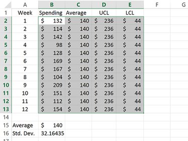
Copy the cells containing the UCL and LCL values and paste them into the cells below them. This will give you straight lines for both the UCL and LCL values in the control chart.
Highlight the cells containing the Average, UCL and LCL data.
Step 9
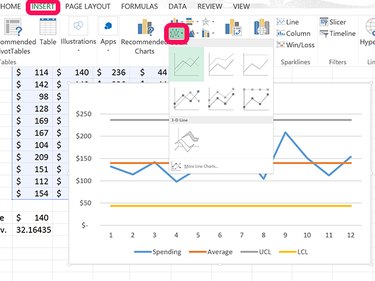
Click the Insert tab and click the Line Chart icon. From the drop-down menu, select the first line chart that appears.
Step 10
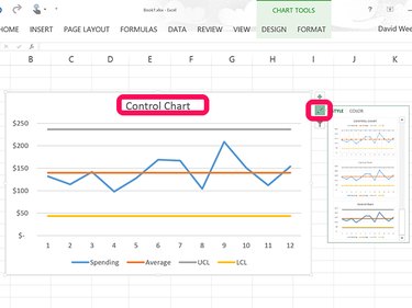
Click the Chart Title at the top of the line chart and replace it with Control Chart. If you want to change the appearance of your chart, click the Style icon beside the chart and select a new style.