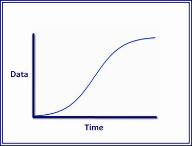
In Microsoft Excel, the S-curve is included in two chart types: Scatter Chart and Line Chart. Using either of these, you can create an S-curve chart that plots the change in one variable in relation to another variable.
Step 1: Enter Data
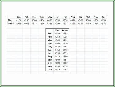
Open Excel and enter your data in a worksheet in either rows or columns. Whichever layout you use, if you have two variables, make sure they are matched by the same period of time.
Video of the Day
Step 2: Highlight the Chart Data
Using the mouse, click into the upper-left cell of the chart data range and while holding down the mouse button, drag the mouse over the data to be used to generate the S-curve chart.
Step 3: Choose the Chart Type
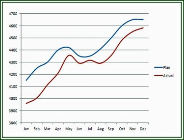
You have some options concerning which chart type to use for an S-curve graph. An S-curve can be plotted in any of four chart types: a Scatter with Smooth Lines chart, a 2-D Line chart, a 2-D Line with Markers chart or a 3-D Line chart.
Video of the Day