Despite Microsoft Excel's many graphing features, creating the right graph in the spreadsheet application with a given set of data can be challenging. If your data has not been already labeled, you may have to manually select the data for the x- and y-axes to tell Excel how to present your information. By following a few simple steps, however, you can manipulate Excel into providing the correct graphical specification.
Step 1
Select the data you want to use for both the x- and y-axes by clicking and holding the mouse button while selecting the cells.
Video of the Day
Step 2
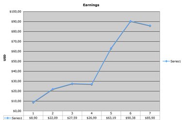
Select the "Line" button from the chart options on the "Insert" tab. Select the style of the line that you want to use. In the resulting graph, Excel will have drawn columns A and B as lines.
Step 3
Right-click the graph. After a menu appears, click the "Select Data..." option to open the "Select Data Source" dialog. Both "Series 1" and "Series 2" are listed under the "Legend Entries" list.
Step 4
Click "Edit" under the "Horizontal Axis Labels" list to open the "Axis Labels" dialog. Click the icon that displays a red arrow, and then highlight the column on the spreadsheet that you want to denote as the x-axis. In this example, this is all the numbers in column A. Click "OK" when finished.
Step 5
Select "Series 1" in the "Legend Entries" list. Click the "Remove" button, and then click "OK." The x-axis now denotes the quantities in column A.
Video of the Day