How to Colorize Old Photos in GIMP: Realistic Workflow
By the end of this guide, you'll take a black-and-white photograph and produce a colorized version that looks plausible not vivid, not obviously filtered, but something a viewer could reasonably mistake for a faded original color print. That standard drives every decision in the workflow.
The sequence: prepare the scan, choose colors before touching a brush, paint zone by zone using GIMP's layer system, apply minimal finishing, then export. Each phase directly serves the final result.
What you'll need: GIMP 3.0, which is free and open-source with no subscription required, as the April 2025 GIMP beginners tutorial confirms. A scanned black-and-white photo saved as JPEG, PNG, or TIFF. For fine-detail areas like hair and fabric, scan at the highest resolution your equipment allows.
Step 1: Protect the original, then clean the scan
Video of the Day
The goal here is a technically clean base: good tonal separation, no physical damage, no scan grain. Colorizing over unrepaired damage amplifies it rather than hiding it.
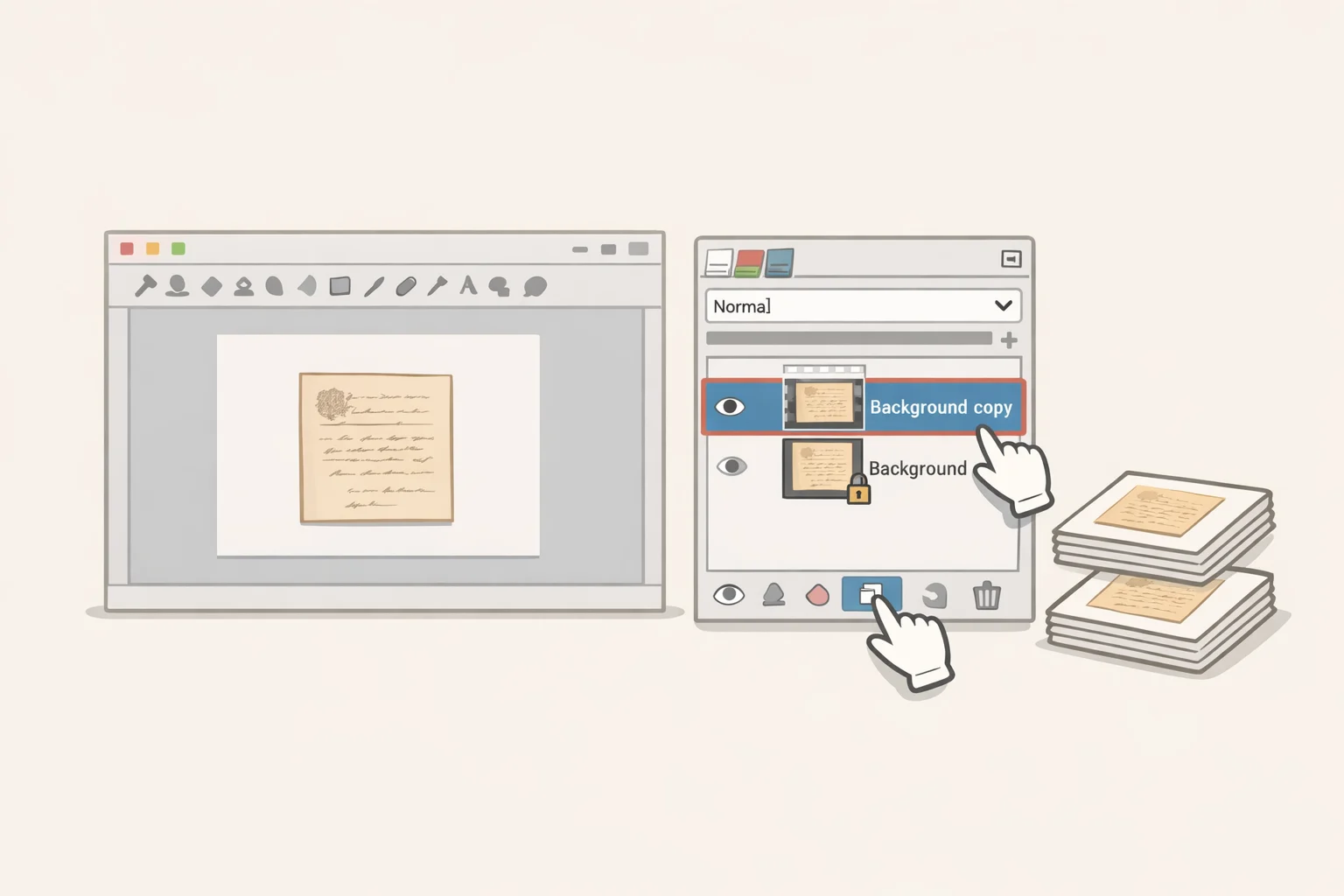
1. Duplicate the background layer. Open the Layers panel (Ctrl+L). Right-click the background layer and choose Duplicate Layer. Work on the copy exclusively. As the July 2024 restoration tutorial recommends, the original stays locked below everything you do, a permanent fallback you can return to at any point.
⚠ GIMP 3.0 preflight read before applying any filter: In GIMP 3.0, filters applied to a layer remain active and re-execute whenever that layer is modified later. This is intentional non-destructive behavior that did not exist in previous stable versions. The consequence: if you apply Brightness-Contrast, Levels, or any other filter to a layer and then paint color on it, previously painted areas can shift color, turn white, or distort. #Raydamon documented this behavior in April 2025 and identified two fixes.
First option: disable non-destructive editing in GIMP's preferences so filters apply once and go inactive. This setting persists after you restart the application. Second option: after applying any filter, press the Fx button in the Layers dialog and choose Merge Filters, which bakes the filter into the layer and deactivates it. Do one of these before painting. The rest of this guide assumes you have.
2. Crop and straighten. Use the Crop tool (Shift+C) to remove scanner borders, torn edges, or unwanted margins. Then select the Rotate tool, click the image, and enter an angle value in the tool options for precise straightening. Tilt that looks negligible in grayscale tends to read as obvious once color is added.
3. Adjust tonal balance. Go to Colors → Brightness-Contrast and increase contrast to separate midtones and make shadow detail visible. For scans that are badly washed out, with no true blacks and everything compressed into the grey middle, also go to Colors → Levels and drag the black-point input slider inward until the darkest tones register as actual black. Color painted over a flat, low-contrast base tends to look muddy no matter how well-chosen the palette is. Both the 2024 restoration guide and the April 2025 GIMP 3.0 tutorial treat tonal correction as a required early step, before any color work begins.
4. Repair physical damage. Select the Heal tool. Hold Ctrl and click an undamaged area to set the sample source, then paint over scratches, spots, or fold lines. GIMP blends the sampled texture into the repair. For larger areas with consistent texture, switch to the Clone tool, which uses the same Ctrl+click workflow but copies pixels directly rather than blending. Keep brush size slightly smaller than the defect you're targeting; a brush that's too large smears surrounding detail into the repair and creates visible patches at full zoom.
5. Run noise reduction. Go to Filters → Enhance → Noise Reduction. Adjust until scan grain softens without losing edge detail. Preview at 100% before applying.
Checkpoint: The duplicate layer should look like a well-printed black-and-white photo, with clear tones, visible shadow detail, no unrepaired damage, and no blown-out highlights. If it still looks flat or washed out, address tonal balance before moving on.
Video of the Day
Step 2: Choose your colors before you open a brush
Skip this step and the rest of the work suffers for it. Palette selection is what separates a result that reads as credible from one that reads as processed. Mora Foto's GIMP colorization tutorial treats palette selection as the first step of the entire process, before any painting begins.
Research the era. Look up reference material from the period and location the photo represents: clothing colors, common paint shades, skin tones, vehicle colors. A 1930s portrait should not have the color temperature of a contemporary smartphone photo. Slightly faded, lower-saturation colors are more historically credible. As Mora Foto notes, early color photography had real technical limitations, and hand-tinted prints from the era used muted pigments by necessity. Lean into that. Colors should feel present but not pushed.
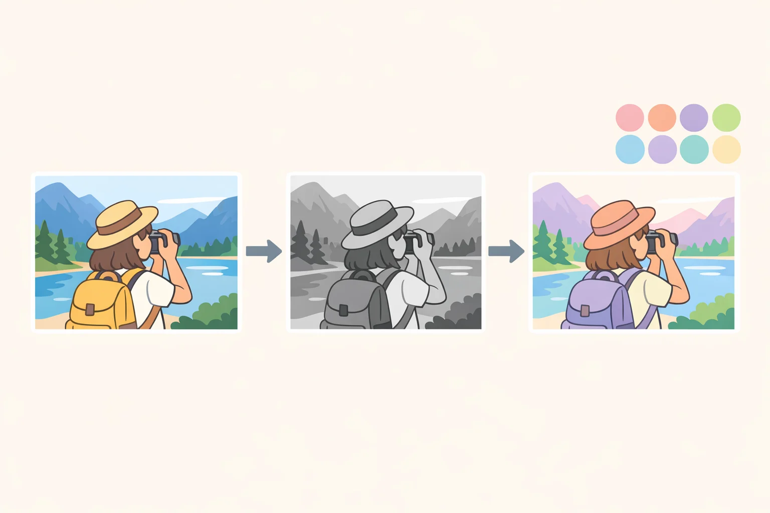
Validate your palette with a test image. One reliable method from the Mora Foto guide: find a color photo from the same era or a similar subject, convert a copy to black-and-white, then re-colorize that copy using your planned palette. Compare the result against the original color version. If the colors read convincingly on a known source, they'll work on the archival image. If they look wrong, adjust before committing.
Plan your zones and layers. Divide the image into logical areas, background, clothing, skin, hair, objects, and assign each its own color layer. For a simple portrait, plan at minimum: skin, clothing, hair, background. One layer per zone keeps edits reversible and prevents color bleed across boundaries. Decide on this structure now. Committing to a layer plan upfront takes five minutes; changing course mid-process costs far more.
Step 3: GIMP colorize black and white photo layer modes, edge control, and palette execution
The blend mode you choose determines whether your grayscale base keeps its luminosity or gets overwritten. Getting this right is the technical core of the whole workflow.
1. Create a new blank layer. In the Layers panel, right-click and choose New Layer. Accept the default transparent fill and click OK. Name it for the zone you're painting, "skin," "jacket," and so on.
2. Set the blend mode to LCh Color. Open the mode dropdown at the top of the Layers panel and select LCh Color. Leave opacity at 100% for now. This mode draws hue and chroma from the color you paint while the layer beneath supplies all luminosity, keeping the original light and shadow structure intact. Mora Foto recommends LCh Color as the primary mode. The GIMP developer documentation explains that layer order and compositing mode govern how GIMP flattens a multi-layer image, so the mode choice has real consequences for the output, not just a visual preview.
3. Paint large areas first. Select the Paintbrush with a large, soft-edged brush. Cover the biggest, most uniform zones, sky, background, large clothing blocks, in rough strokes before narrowing to detail. Reduce brush size progressively as you work toward edges and transitions.
4. Color guidance by zone:
- Skin: Warm mid-tones, noticeably desaturated. Oversaturated skin reads as theatrical immediately.
- Clothing: Reference your palette; use slightly less-saturated versions of each color than your instinct suggests.
- Hair: Dark browns and blacks need less saturation than expected. Pure black hair reads better with a slight warm brown bias than absolute black.
- Background: Keep it neutral and understated. The subject carries the visual weight; the background should recede.
5. Handle edges with selections and masks. Hairlines, collars, and hands are where sloppy colorization announces itself. A large soft brush that works fine on open backgrounds will bleed color across fine edges and ruin the effect. There are three approaches worth knowing.
For clearly bounded zones like a jacket lapel or a solid background, draw a selection with the Free Select tool (F) before painting. Any strokes you make stay inside the selection boundary, letting you paint freely without worrying about bleed. Press Select → None when done.
For complex organic edges like hair against a light background, Quick Mask gives more control. Press Q to enter Quick Mask mode, paint a red mask over the area you want to protect, then press Q again to convert the mask to a selection. Paint your color zone, then deselect. Zoom to 100% and refine edges by toggling Quick Mask on again and touching up with a small brush.
For zones that need gradual or semi-transparent edges, use a layer mask instead of painting directly. With the color layer active, go to Layer → Mask → Add Layer Mask and choose white (full coverage). Paint black onto the mask to hide color in specific areas, grey to make it semi-transparent. This is slower than Free Select but gives the most precise control over difficult transitions, and it stays editable. The mask can be adjusted at any point before you merge.
6. Adjust opacity before merging. If color reads too strongly on a zone, lower that layer's opacity before merging. Mora Foto recommends starting at 100% but evaluating before each merge, since some zones absorb color differently depending on their underlying brightness.
7. Test alternative modes on difficult areas. If LCh Color produces unexpected results on high-contrast areas, duplicate the layer and try HSL Color or Grain Merge on the copy before committing. The Mora Foto guide notes both can work well depending on image characteristics. Compare at 100% zoom, then decide which to keep.
8. Merge each zone's layer once satisfied. Go to Layer → Merge Down. Then immediately go to Colors → Hue-Saturation and check whether the merged result needs saturation pulled back. Slightly faded is usually right. For tonal corrections after merging, use Colors → Curves for fine control. As Mora Foto notes, Curves is the most precise tool for tonal correction after colorization.
⚠ Troubleshooting:
- Muddy or grey-looking color: The base image is too low-contrast. Return to Step 1's tonal correction before continuing.
- Oversaturation: Pull the Saturation slider down in Colors → Hue-Saturation after merging. Faded color is often the correct period-accurate look, not a failure.
- Color bleeding past edges: Reduce brush size significantly near boundaries, or use Free Select or Quick Mask to isolate the zone before painting, as described above.
- Previously painted areas changing color after further edits: This is the GIMP 3.0 non-destructive filter issue. Use Merge Filters from the Fx button before continuing. See the Step 1 preflight note.
Checkpoint: View the full image at normal zoom before moving on. Colors should feel present without looking pushed. If any zone reads too vivid, reduce saturation on that area. If shadow and highlight detail from the original is no longer visible through the color, check that each layer is still set to LCh Color, not Normal. The image isn't ready for finishing until the colorization itself is convincing at normal zoom.
Step 4: Polish lightly finishing effects in proportion
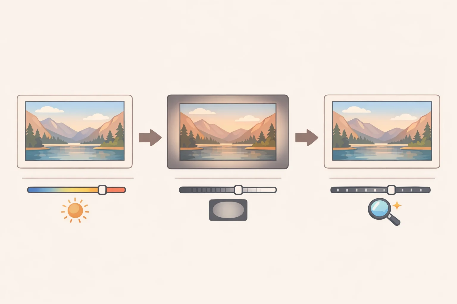
These are supporting adjustments, not required steps. Each serves a specific purpose; none should be visible as an obvious effect in the finished image. Apply conservatively, evaluate at normal zoom, and stop before the edit becomes the thing you notice.
1. Add warmth. Go to Colors → Color Temperature and shift slightly warmer. A value around 7000K adds appropriate warmth for aged photographic paper, as demonstrated in the April 2025 GIMP 3.0 tutorial. If the result reads orange, it's too much.
2. Add a vignette. Go to Filters → Light and Shadow → Vignette. This darkens the photo's edges and pulls attention toward the subject, and it complements the aged-photo look in a way that reads as natural degradation rather than a digital effect. The April 2025 tutorial notes it's non-destructive in GIMP 3.0, so you can return and adjust without reapplying. If you can see where the vignette begins as a visible edge, reduce its strength or expand its radius.
3. Sharpen carefully. Go to Filters → Enhance → Sharpen (Unsharp Mask). A radius of 1.0 is a reasonable starting point. Both the April 2025 GIMP tutorial and the 2024 restoration guide caution that more sharpening introduces more noise, and oversharpening creates artifacts. If sharpening makes repaired damage more visible, back off.
4. Run a final noise reduction pass. Go to Filters → Enhance → Noise Reduction. A value around 5 handles grain introduced by sharpening and earlier tonal adjustments, as the April 2025 tutorial suggests. Preview at 100% zoom before applying; over-smoothing softens detail you want to keep.
Export: preserving the work
1. Save a layered master first. Before flattening or exporting, save the working file as a GIMP native .xcf file via File → Save As. This preserves all layers, layer modes, and non-destructive filter settings for future edits. Since the subject is an archival photograph, keeping an editable master separate from any export is good preservation practice, not just a convenience.
2. Crop for final composition if needed. Use the Crop tool (Shift+C) to remove remaining edge artifacts or reframe the image.
3. Export the final image. Go to File → Export As, name the file with a .jpg or .png extension, and click Export. For digital sharing, a JPEG quality setting of 85 balances file size with visual fidelity, as the April 2025 GIMP tutorial suggests. For a master intended for printing or long-term preservation, use PNG or a JPEG quality of 95 or above.
The same workflow, duplicate, repair, balance tones, choose a palette, paint by zone, polish lightly, export, applies to virtually any archival black-and-white photo. It's also the foundation for a broader restoration pass: once the colorization is done and convincing at normal zoom, the same tonal and finishing tools used here can help you restore old photos with GIMP more thoroughly, correcting exposure, lifting shadow detail, and cleaning up scan artifacts before the final export. A convincing result looks like something that could have existed, not like something that was made.