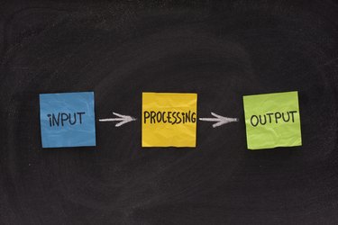
An input process output, or IPO, chart is simply a way to describe how your business processes information. Usually, an IPO chart is the precursor to using software for specific purposes. The chart has three components, and you write the description of each component in plain English, not code or mathematical formulas. Making an IPO chart helps you understand what you can expect to get out of the data you gather and process.
Layout of the Chart
Video of the Day
You can create a simple table, with three boxes in a single row, for your IPO chart. Leave room to label the boxes with "Input," "Process" and "Output." If you are going to track more than one kind of data, you can add additional rows. If you do add rows, you may find it useful to label each row with a heading placed just to the left of the first box.
Video of the Day
Data for Input Box
In your "input" box, describe whatever data you want to process. To give a simple example, you could write "Number of hours worked." A more complex example might be, "Unique visitors to our website in any given month." Both of these examples show data that you intend to manipulate to create usable conclusions for your business.
Data for Process Box
In the "Process" box, describe what you intend to do with the data. For example, with "Number of hours worked," you might describe how you process that data as, "Multiply hours worked by wages per hour." For the website visitors example, you could write, "move all email addresses of unique visitors to group email folder." The word "process" can seem technical, but in reality it is simply what you plan to do to make the input data useful.
Data for Output Box
In the "Output" box, describe the output you want for the data you processed. This is the practical result you can use. For the "hours worked" data, processing it by multiplying times hourly wages results in an output of total money spent on wages. For the website visitor data, processing the email addressed by placing them in a folder can result in an output of "send welcome emails to all unique visitors."
Advanced Input Process Output Charts
IPO charts come from the world of information technology, and software designers use them to create complex software. You can use an IPO chart for extremely complex processes that are more sophisticated than the aforementioned examples. However, if you keep your IPO chart in simple English, you will have a solid understanding of the IPO process, even if the execution is complicated.