With Word 2013's ability to create a chart, you don't need to open Excel to build an XY scatter plot. Pick a chart style and enter values to plot the points on a graph. The only trick: You have to start by inserting a chart; entering your values into a table won't do the job.
Step 1: Insert a Chart
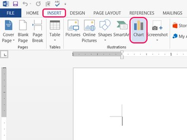
Place the cursor at the spot you want your scatter plot to appear, open the Insert tab and click Chart in the Illustrations section.
Video of the Day
Step 2: Choose a Scatter Type
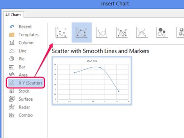
Select X Y (Scatter) and pick one of the styles. Click OK to create a sample chart with a few points already entered.
Step 3: Replace the Sample Data
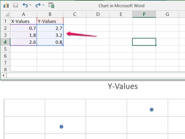
Overwrite the sample data in the spreadsheet with your own data to start building your scatter plot.
Step 4: Add More Data
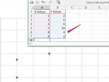
Add as many values as you need in the two (or three) columns. As you add more data sets, Word automatically includes them in the scatter plot. Word also automatically adjusts the scope of the chart to fit all of the data. After entering all of the data, close the spreadsheet window.
Step 5: Add Chart Elements
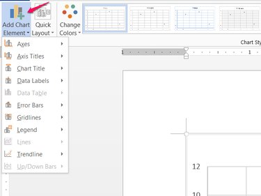
Click Add Chart Element on the Design tab (or click the + icon next to the chart) to add, move or remove chart elements such as the title, legend and axis labels.
Video of the Day