Opera One Vertical Tabs Explained: How Tab Islands Set It Apart
Opera shipped stable version 133.0.5932.85 today, bringing Opera One vertical tabs and a repositioned Google Lens integration to all users, according to the Opera Desktop Blog. The release also includes a round of fixes across pinned tabs, split screen, and the tab strip. Chrome began rolling out its own vertical tabs in April, pitching the feature around fuller tab titles, easier multitasking, and never losing a tab, per Google's announcement.
So Opera now has vertical tabs. The more useful question is whether Opera's version does anything Chrome's doesn't. The answer involves Tab Islands, Opera's contextual tab grouping system, and how the vertical layout connects to a workspace model the company has been assembling piece by piece through 2026. The Google Lens upgrade follows the same logic: take a feature that was already there but hard to find, move it somewhere obvious, and cut the friction that kept most users from reaching it.
How Opera One vertical tabs work and why Tab Islands are the point
Video of the Day
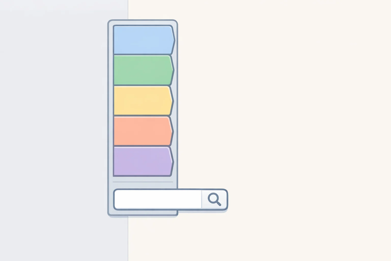
Enabling vertical tabs moves the tab strip from the top of the browser to a resizable panel on the left side, where full tab titles stay readable regardless of how many tabs are open. That's the direct fix for horizontal strips that collapse to favicon-only once tab counts climb, Opera explains. The panel can collapse to icon-only view when screen width matters more than tab names, or disappear entirely for maximum space.
The layout also reclaims vertical real estate. Without a horizontal bar eating into the top of the screen, pages get more height useful when reading long-form content or working through a document, Opera notes. Pinned tabs move to an icon grid at the top of the strip. A keyword search function, accessed via a magnifying glass icon at the top right of the panel, lets users locate any open tab by keyword a practical feature for heavier tab users once a session stretches past a dozen tabs, per Opera's technical walkthrough.
That covers the mechanics. Here's where it parts ways with Chrome.
Tab Islands persist intact when switching to the vertical layout and remain intact when switching back, Thurrott confirmed today. In the vertical strip, each Island displays a tab count, carries an automatically assigned name that users can rename, and uses a redesigned light color gradient built for faster visual scanning between contexts, according to Opera's technical post. Tab Island naming and color-coding were introduced in the R3 release earlier this year. What's new is that those systems now carry into the vertical layout rather than being left behind when you switch.
Right-clicking any tab in the vertical strip adds one new option: close all tabs above or below the selected one. It's a bulk cleanup tool for users who let sessions accumulate and need to pare them down without closing everything at once, Opera details.
The feature is optional throughout. The quickest way to enable it is a right-click on any tab and selecting "Use vertical tab strip" from the context menu, though Easy Setup and browser Settings offer the same toggle, Opera explains. Horizontal tabs remain the default; Opera hasn't hidden the standard experience behind the new layout.
One caveat worth noting: Tab Emojis and Volume Booster are unavailable in vertical mode. Both depend on the hover tooltip present in horizontal layout, which the vertical strip doesn't include, Opera acknowledges. Users who rely on either will need to stay on horizontal tabs, or toggle back when needed.
Video of the Day
Opera One's Google Lens upgrade turns reverse image search into a home-page tool
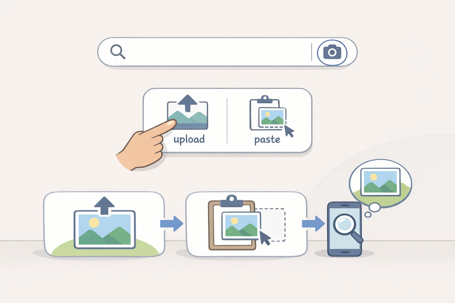
Google Lens has been in Opera One since last September, but it was less prominent in the interface than today's change makes it. The update is primarily about placement, Thurrott noted.
Lens is now built directly into the home page search bar. Clicking its icon opens a dialog that accepts images four ways: file upload, drag-and-drop, clipboard paste, or direct image URL, Opera explains. That covers the most common ways someone might have an image ready to search. Results load in the current tab rather than opening a new one, keeping context switching to a minimum. The practical upshot is that Opera One's reverse image search is now a two-click operation from the home page rather than something users had to go looking for.
The change resembles Opera's earlier push to surface Gmail and Google Calendar in the browser sidebar, per the Opera One R3 announcement. The browser isn't adding new capabilities so much as removing the steps that stood between users and capabilities they already had.
What this update says about Opera's competitive position
Vertical tabs are no longer a differentiator on their own. Chrome has them, Edge has had them for years, and the productivity pitch around fuller tab titles and easier multitasking is now standard industry language.
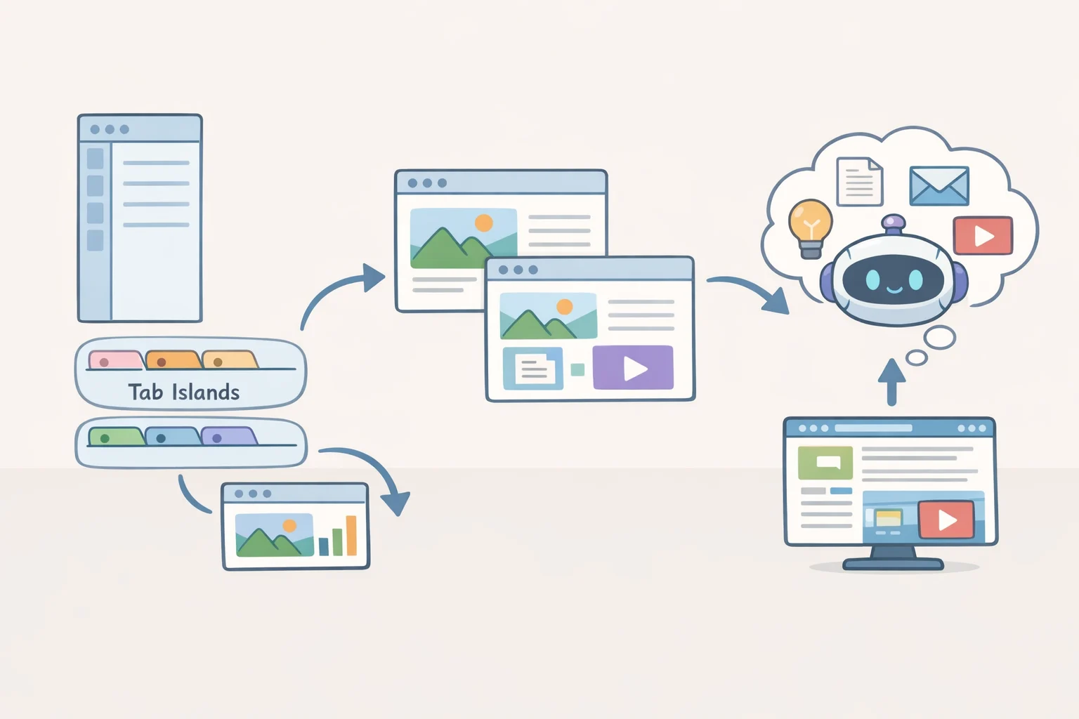
Opera's argument, as reflected in its product direction through 2026, is that the combination matters. Vertical tabs connect to Tab Islands; Tab Islands connect to Workspaces; Opera's browser AI can use the context of the current tab or Tab Island rather than pulling from everything open at once, per the R3 release. Split screen, also introduced in R3 earlier this year, supports up to four simultaneous tabs in multiple layouts. Today's release also shipped fixes across pinned tabs, split screen, and the tab strip alongside the new features, per the Desktop Blog, which suggests the team is treating integration quality as part of the feature, not a follow-up task.
Whether that argument converts into user preference is harder to assess from an announcement alone. Nearly all available detail comes from Opera's own blogs and one secondary report confirming the rollout; there's no independent evaluation of how these pieces perform under real conditions. The integration story is coherent on paper. The question worth watching over the next few months is whether Opera keeps deepening that ecosystem or shifts toward chasing parity features one at a time and whether users who haven't already invested in Tab Islands and Workspaces find enough reason to start.